Football Statistics Analysis
Predicting Football Game Point Totals Using Machine Learning
By: Saleem Khan

Photo by Joe Calomeni from Pexels
Background
With the NFL conference championships now complete I thought it would be timely to take a closer look at some football statistics ahead of the Super Bowl. I’m not a huge football fan but analyzing this data is a great way to get a better feel for the game and the statistics that drive it.
Problem Statement
The objective of this exercise is to determine which team statistics have the greatest impact on the amount of total points scored during an NFL Game. This problem statement is very specific because I want to be able to compare my modeled output to the Las Vegas Over/Under betting line (see below). I am merely using this as a comparison benchmark for the machine learning model i will produce.
Note: I have no aspirations of becoming a professional sports gambler! ;-)
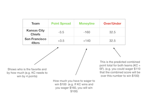
NFL Betting Lines
Las Vegas needs to be correct on their betting lines at least 52.4% of the time in order to break even. Therefore any model I come up with will need to beat these odds in order to be profitable. I will be focusing on the Over/Under betting line above since this is probably the easiest number to predict.
This sort of analysis can help for more than just betting, there are multiple constituents that can benefit from this sort of analysis:
- NFL Teams: By analyzing point totals for the entire league and comparing their individual point totals, teams can better adjust their player roster to improve scoring.
- NFL Players: Players can get a better sense of how best to tackle (pun intended) their opponents in the coming weeks.
- Fans: Fans can better enjoy the game and have hours of commentary by knowing where their favorite teams excel or need improvement.
Data Selection & Web Scraping

Photo by Markus Spiske temporausch.com from Pexels
As I started this data analysis I had to find a reliable source for statistics on NFL games. The best provider I could find that also allowed webscraping was the Pro Football Reference page. This site has an amazing depth of detail in the statistics they capture for each and every game.
Once I was able to identify a provider my next task was to determine a good way to get the data I needed. I wanted to look at 3 years worth of data for all 32 NFL teams. This would include all 16 regular season games as well as playoffs and Super Bowls. I decided to use the Selenium driver provided by Google (i.e. essentially a stripped down version of Chrome used for webscraping) in order to capture the data on each web page. I then needed to use a Python library called BeautifulSoup in order to pull the specific fields i needed.
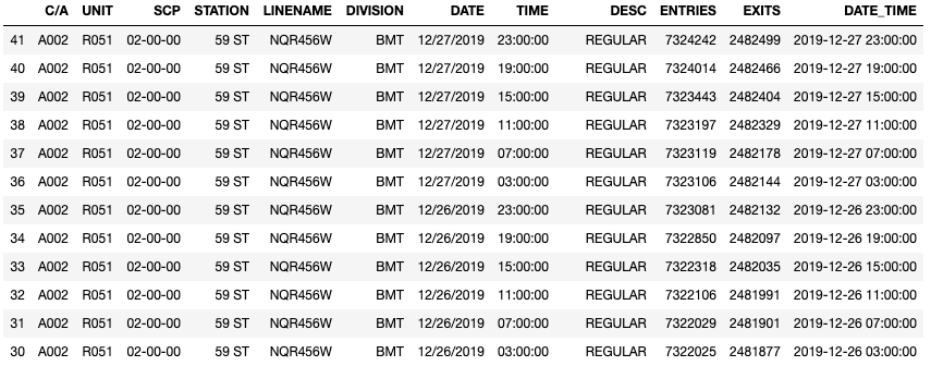
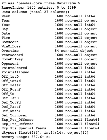
After a bit of coding I was able to gather 1600 rows and 27 columns of data which represent each individual game played. Each of the columns will be a potential feature in my machine learning model. The output from my Python dataframe below gives you a sense of the type of data i will be analyzing.
Exploratory Data Analysis
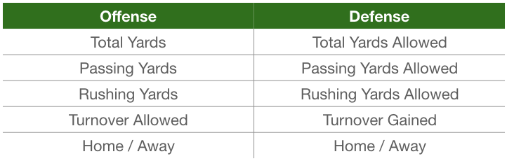
Once the dataset was scraped and loaded into a Python Pandas dataframe I was then able to do some exploratory analysis to get a better feel for the data. After looking at some of my columns I realized that many of the features would not be helpful in a machine learning model. Items like week, time and even team name are not logically predictive of what the point total will be for a game. I whittled down my initial 27 features to just 11. I also combined the Points Scored and Points Allowed fields into a new column called OverUnder which is the y or the dependent variable in our model that we are trying to predict. The image below gives you a general overview of the data that will be going into my model.
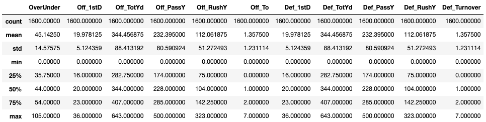
Note: Does something seem odd in the description above? All of the offensive and defensive summary statistics are the same! This is because our dataset capture stats on both teams that played. For instance if the Patriots played the Jets then the defensive stats for the Patriots would be the same as the offensive stats for the Jets and vice versa. This was actually a good way to see if there were any errors in my data. If any of the basic statistics were not correct here there might have been some error in these summary statistics.
Next, let’s get a general birds-eye view of our data in order to see how it is shaped. I used a basic matplotlib histogram in order to visualize this data:
#let's get a visual of our dataset
df.hist(figsize = (20, 20), layout=(6, 3), bins = 'auto')
plt.tight_layout()
plt.savefig('charts/histogram.png')
plt.show()
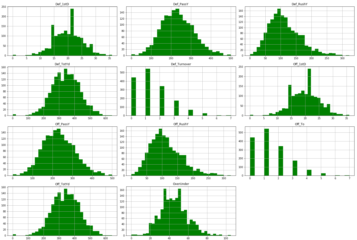
Our data looks normally distributed overall so we won’t need to do much feature engineering.
Initial Correlation Review
After loading our data in and getting a sense of the shape and summary statistics i now need to look at how the datasets correlates with the OverUnder statistic we are trying to predict. The heatmap below shows the each individual feature and how much it correlates with the point total as well as the other features.
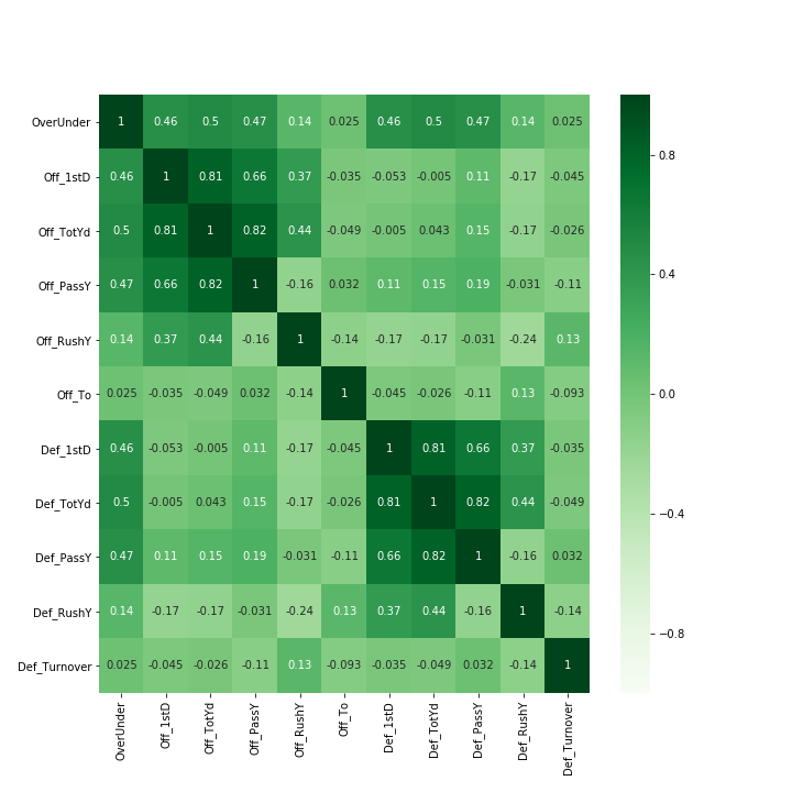
One thing to note here is that the offensive and defensive total yards are highly correlated to passing yards. This makes sense because total yards are a combination of passing and rushing yards. This is an example of multicolinearity which can introduce statistical noise in my model. I may tweak my model later by removing the total yards stat to see if this improves our R2. Note: R2 is a measure of the influence our independent variables have on our dependent variable (PointsTotal or OverUnder in this case)
Machine Learning Model
Now that we have a good sense of our dataset and multicollinearity (i.e. redundancy) within our features we can proceed with creating our first model. I employed a basic train, test and validate along with a K-Fold segmentation.
- Train, Validate, Test: This means that we will split our entire dataset into portions. 40% to train our model, 40% to validate our model and the last 20% to test our model. This is a standard approach to machine learning.
- K-Fold: This is an approach where we iterate through our entire dataset at randomized intervals in order to run a new random chunk of our data through our model. This is a great way to see whether our model performs consistently across different groupings of our data.
I decided to try out three different models using the K-fold technique. I worked with basic linear regression, ridge regression and lasso regression. Python makes it very easy to quickly run these sorts of models. Often it only takes a few lines of code as seen below.
    #Linear Regression
    lm = LinearRegression()

    #Ridge Regression - The alpha value is a hyperparameter that needs to be optimized for best fit.
    lm_ridge = Ridge(alpha=1)

    #Lasso Regression
    lm_lasso = Lasso(alpha=0.1)
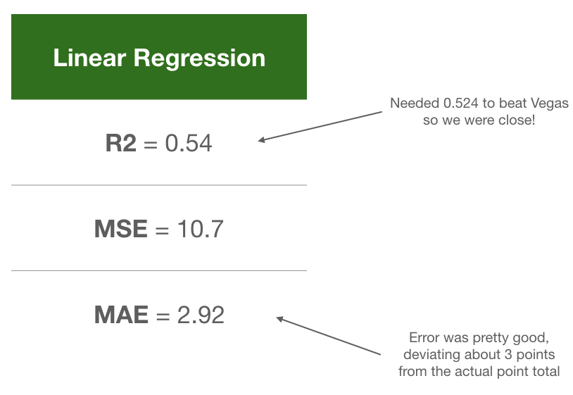
After running my data through these models i received very similar results for the R2 metric:
Linea scores:  [0.5389065856889645, 0.5389065856889645, 0.5389065856889645, 0.5389065856889645, 0.5389065856889645]
Ridge scores:  [0.5389148915059347, 0.5389148915059347, 0.5389148915059347, 0.5389148915059347, 0.5389148915059347]
Lasso scores:  [0.5402006830177307, 0.5402006830177307, 0.5402006830177307, 0.5402006830177307, 0.5402006830177307]
We can read this as our independent variables (game statistics) explaining about 54% of the variability in our over/under or points total. Remember that we wanted to beat the Las Vegas odds of 52.4%. Looks like we did it but not so fast. We do need to look at another metric, our mean absolute error (MAE) to get a sense of how much our model’s predicted point totals deviated from the actuals in our test dataset.
Here are the mean absolute error calculations for all three models:
Linea MAE:  2.927044316714102
Ridge MAE:  3.8878462965670018
Lasso MAE:  3.877920193274435
We can see above that the basic linear regression model had the lowest MAE, meaning its average prediction error was about 3 points from the actual score. This isn’t too bad but it’s still not enough to beat Vegas. With this error we would be hovering right around the 52.4% odds that Vegas has.
Conclusion & Follow-Up
In the end I wasn’t able to beat Vegas but it was fun going through the process. I was able to collect the data needed, perform some exploratory analysis, do basic feature engineering and run a machine learning model. The last thing we need to do is look at some of the coefficients our model produced in order to see how each feature influenced our overall point totals.
Off_1stD : 0.56
Off_TotYd : 0.04
Off_PassY : 0.02
Off_RushY : 0.02
Def_1stD : 0.59
Def_TotYd : 0.04
Def_PassY : 0.02
Def_RushY : 0.02
HomeOrAway : -0.72
The list above is telling us that for every total yard gained (combined passing and rushing) we can expect our point total to improve by 0.04. Said another way we can expect an addition of 4 total points for every 100 total yards gained by either team.
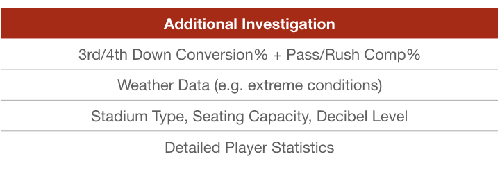
Also, an additional bit of follow up here would be to look at adding in some more data to see what would help us create a better model. I’ve listed out some additional items to look into in the future.